Alert Dialog
Alert dialogs can be used for confirmations, warnings, informational messages and more.
Options
| Option | Type | Required | Default | Description |
|---|---|---|---|---|
header | string | No* | nil | The dialog header text |
content | string | No* | nil | The main content text |
icon | string | No | nil | FontAwesome icon class |
iconColor | string | No | '#71717A' | Icon color (hex) |
labels | table | No | {} | Button labels: { cancel = 'Cancel', confirm = 'Confirm' } |
type | string | No | 'default' | Dialog type: 'default', 'success', 'destructive' |
size | string | No | 'md' | Dialog size: 'xs', 'sm', 'md', 'lg' |
cancel | boolean | No | true | Whether to show cancel button |
*Either header or content is required.
Return Values
'confirm'- User clicked confirm'cancel'- User clicked cancel or closed dialog
Example
local result = exports.lation_ui:alert({
    header = 'Delete Item',
    content = 'Are you sure you want to delete this item?',
    icon = 'fas fa-trash',
    iconColor = '#EF4444',
    type = 'destructive',
    labels = {
        confirm = 'Delete',
        cancel = 'Keep'
    }
})

if result == 'confirm' then
    print('Item deleted!')
end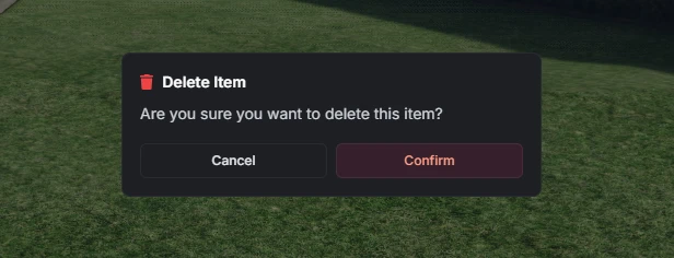
Input Dialog
Input dialogs provide forms with various field types for collecting user data.
Dialog Options
| Option | Type | Required | Default | Description |
|---|---|---|---|---|
title | string | No | nil | Dialog title |
subtitle | string | No | nil | Dialog subtitle |
submitText | string | No | 'Submit' | Submit button text |
cancelText | string | No | 'Cancel' | Cancel button text |
type | string | No | 'default' | Dialog type: 'default', 'success', 'destructive' |
options | table | Yes | {} | Array of input fields |
Field Options
| Option | Type | Required | Default | Description |
|---|---|---|---|---|
type | string | Yes | nil | Field type: 'input', 'number', 'toggle', 'checkbox', 'select', 'multi-select', 'slider', 'textarea' |
label | string | Yes | nil | Field label |
description | string | No | nil | Field description |
placeholder | string | No | nil | Placeholder text |
icon | string | No | nil | FontAwesome icon class |
iconColor | string | No | '#71717A' | Icon color (hex) |
required | boolean | No | false | Whether field is required |
disabled | boolean | No | false | Whether field is disabled |
min | number | No | nil | Minimum value (number/slider) |
max | number | No | nil | Maximum value (number/slider) |
step | number | No | 1 | Step value (number/slider) |
unit | string | No | nil | Unit label (slider) |
options | table | No | {} | Options for select/multi-select |
default | any | No | nil | Default field value |
checked | boolean | No | nil | Alias for default on toggle/checkbox types |
Notes:
'checkbox'is an alias for'toggle'- both render the same component.'checked'is an alias for'default'on toggle/checkbox types.
Return Values
- Table of values (indexed by field order) or
nilif cancelled
Example
local result = exports.lation_ui:input({
    title = "User Profile",
    subtitle = "Enter your information",
    submitText = "Save",
    options = {
        {
            type = 'input',
            label = 'Username',
            description = 'Input your username below',
            placeholder = 'IamLation',
            icon = 'fas fa-user',
            required = true
        },
        {
            type = 'number',
            label = 'Age',
            description = 'Input your age below',
            icon = 'fas fa-birthday-cake',
            required = true,
            default = 18
        },
        {
            type = 'select',
            label = 'Country',
            description = 'Select your country',
            icon = 'fas fa-globe',
            options = {
                { label = 'United States', value = 'us' },
                { label = 'Canada', value = 'ca' },
                { label = 'United Kingdom', value = 'uk' },
                { label = 'Australia', value = 'au' }
            }
        },
        {
            type = 'toggle',
            label = 'Receive Notifications',
            description = 'Toggle notifications on or off',
            icon = 'fas fa-bell',
            default = true
        },
        {
            type = 'slider',
            label = 'Volume',
            description = 'Adjust the volume level',
            icon = 'fas fa-volume-up',
            min = 0,
            max = 100,
            unit = '%',
            default = 50
        }
    }
})

if result then
    print('Username:', result[1])
    print('Age:', result[2])
    print('Country:', result[3])
    print('Notifications:', result[4])
    print('Volume:', result[5])
end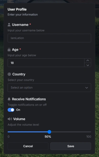
Menu
Context menus provide navigation and action selection with hierarchical support.
Registration Options
| Option | Type | Required | Default | Description |
|---|---|---|---|---|
id | string | Yes | nil | Unique menu identifier |
title | string | No | nil | Menu title |
subtitle | string | No | nil | Menu subtitle |
menu | string | No | nil | Parent menu ID (for back navigation) |
canClose | boolean | No | true | Whether menu can be closed with ESC |
options | table | Yes | {} | Array of menu options |
Option Properties
| Option | Type | Required | Default | Description |
|---|---|---|---|---|
title | string | Yes | nil | Option display text |
icon | string | No | nil | FontAwesome icon class |
iconColor | string | No | '#71717A' | Icon color (hex) |
iconAnimation | string | No | nil | Icon animation: 'spin', 'spinPulse', 'spinReverse', 'pulse', 'beat', 'fade', 'beatFade', 'bounce', 'shake', |
description | string | No | nil | Option description |
keybind | string | No | nil | Keybind display text |
disabled | boolean | No | false | Whether option is disabled |
readOnly | boolean | No | false | Whether option is read-only (no click) |
menu | string | No | nil | Submenu ID to open |
arrow | boolean | No | false | Show arrow indicator (auto-set for submenus) |
progress | number | No | nil | Progress bar value (0-100) |
progressColor or colorScheme | string | No | '#3B82F6' | Progress bar color (hex) |
image | string | No | nil | URL to an image displayed in the hover metadata |
metadata | table | No | nil | Additional information displayed on hover (see Metadata) |
onSelect | function | No | nil | Callback function |
event | string | No | nil | Client event to trigger |
serverEvent | string | No | nil | Server event to trigger |
args | any | No | nil | Arguments for events |
Metadata
The metadata property displays additional information in a hover card. It supports three formats:
String Array
metadata = {
    "Additional info line 1",
    "Additional info line 2",
    "Additional info line 3"
}
Key-Value Object
metadata = {
    ["Property 1"] = "Value 1",
    ["Property 2"] = "Value 2",
    ["Status"] = "Active"
}
Structured Array (Recommended)
metadata = {
    { label = "Health", value = "85%" },
    { label = "Armor", value = "100%" },
    { label = "Experience", value = "1,250 XP", progress = 75, progressColor = "#3B82F6" },
    { label = "Level Progress", value = "3/4", progress = 75, progressColor = "#10B981" }
}
Metadata Item Properties
| Property | Type | Required | Description |
|---|---|---|---|
label | string | Yes | The label text |
value | any | Yes | The value to display |
progress | number | No | Progress bar value |
progressColor or colorScheme | string | No | Progress bar color (hex) |
Functions
-- Register a menu
exports.lation_ui:registerMenu(menuData)

-- Show a registered menu
exports.lation_ui:showMenu(menuId)

-- Hide the current menu
exports.lation_ui:hideMenu()

-- Get the currently open menu ID
local menuId = exports.lation_ui:getOpenMenu()
Example
-- Register main menu
exports.lation_ui:registerMenu({
    id = 'main_menu',
    title = 'Game Menu',
    subtitle = 'Select an option',
    options = {
        {
            title = 'Profile',
            description = 'View your profile',
            icon = 'fas fa-user',
            iconColor = '#3B82F6',
            menu = 'profile_menu',
            image = 'https://example.com/avatar.jpg',
            metadata = {
                { label = "Level", value = "42" },
                { label = "Experience", value = "1,250 XP", progress = 75, progressColor = "#3B82F6" },
                { label = "Reputation", value = "Good Standing" },
                { label = "Playtime", value = "120 hours" }
            }
        },
        {
            title = 'Settings',
            description = 'Game settings',
            icon = 'fas fa-cog',
            iconColor = '#6B7280',
            onSelect = function()
                print('Opening settings...')
            end
        },
        {
            title = 'Health',
            description = 'Current health status',
            icon = 'fas fa-heart',
            iconColor = '#EF4444',
            progress = 85,
            progressColor = '#EF4444',
            readOnly = true
        }
    }
})

-- Register submenu
exports.lation_ui:registerMenu({
    id = 'profile_menu',
    title = 'Profile',
    menu = 'main_menu', -- Back to main menu
    options = {
        {
            title = 'Edit Profile',
            icon = 'fas fa-edit',
            event = 'openProfileEditor'
        },
        {
            title = 'View Stats',
            icon = 'fas fa-chart-bar',
            serverEvent = 'getPlayerStats'
        }
    }
})

-- Show the menu
exports.lation_ui:showMenu('main_menu')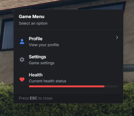
Notification
Notifications with customizable positioning, styling and more.
Options
| Option | Type | Required | Default | Description |
|---|---|---|---|---|
title | string | No | nil | Notification title |
message | string | Yes* | nil | Notification message |
type | string | No | 'info' | Type: 'info', 'success', 'warning', 'error' |
duration | number | No | 5000 | Duration in milliseconds |
position | string | No | 'top-right' | Position: 'top-left', 'top-center', 'top-right', 'bottom-left', 'bottom-center', 'bottom-right', 'center' |
icon | string | No | nil | FontAwesome icon class |
iconColor | string | No | Auto | Icon color (hex) |
bgColor | string | No | Auto | Background color (hex) |
txtColor | string | No | Auto | Text color (hex) |
*Either title or message is required.
Example
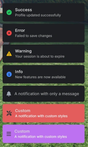
exports.lation_ui:notify({
    title = 'Success',
    message = 'Profile updated successfully',
    type = 'success',
})

exports.lation_ui:notify({
    title = 'Error',
    message = 'Failed to save changes',
    type = 'error',
})

exports.lation_ui:notify({
    title = 'Warning',
    message = 'Your session is about to expire',
    type = 'warning',
})

exports.lation_ui:notify({
    title = 'Info',
    message = 'New features are now available',
    type = 'info',
})

exports.lation_ui:notify({
    message = 'A notification with only a message',
})

exports.lation_ui:notify({
    title = 'Custom',
    message = 'A notification with custom styles',
    bgColor = '#e35c5c',
    icon = 'fas fa-screwdriver-wrench',
    iconColor = '#3a3a3a',
    txtColor = '#e5e5e5',
})

exports.lation_ui:notify({
    title = 'Custom',
    message = 'A notification with custom styles',
    bgColor = '#bd71f2',
    icon = 'fas fa-bars',
    iconColor = '#3a3a3a',
    txtColor = '#e5e5e5',
})
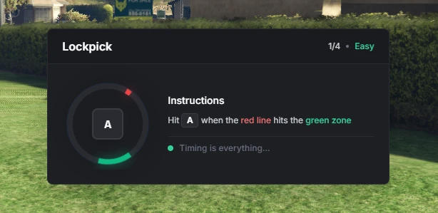
Skill Check
Interactive skill check mini-game with configurable difficulty.
Options
| Option | Type | Required | Default | Description |
|---|---|---|---|---|
title | string | Yes | nil | Title for skill check |
difficulty | string/table | Yes | nil | Difficulty level or array of difficulties |
inputs | table | No | {'W', 'A', 'S', 'D'} | Array of input keys |
Difficulty Levels
'easy'- Large target area, slow speed'medium'- Medium target area, medium speed'hard'- Small target area, fast speed- Custom object:
{ areaSize = 20, speedMultiplier = 1.5 }
Functions
-- Start skill check
local success = exports.lation_ui:skillCheck(title, difficulty, inputs)

-- Cancel active skill check
exports.lation_ui:cancelSkillCheck()

-- Check if skill check is active
local isActive = exports.lation_ui:skillCheckActive()
Return Values
true- All skill checks completed successfullyfalse- Failed or cancelled
Example
local success = exports.lation_ui:skillCheck('Lockpick', {'easy', 'easy', 'easy', 'easy'}, {'W', 'A', 'S', 'D'})

if success then
    print('Success')
else
    print('Failed')
end

-- Custom difficulty
local success = exports.lation_ui:skillCheck('Lockpick', {
    { areaSize = 15, speedMultiplier = 2.0 },
    { areaSize = 10, speedMultiplier = 2.5 }
})
Progress Bar
Progress bar with optional multi-step feature & more.
Options
| Option | Type | Required | Default | Description |
|---|---|---|---|---|
label | string | Yes | nil | Progress bar label |
description | string | No | nil | Progress description (overridden by steps) |
duration | number | Yes | nil | Duration in milliseconds |
icon | string | No | nil | FontAwesome icon class |
iconColor | string | No | '#71717A' | Icon color (hex) |
iconAnimation | string | No | nil | Icon animation: 'spin', 'spinPulse', 'spinReverse', 'pulse', 'beat', 'fade', 'beatFade', 'bounce', 'shake' |
color | string | No | '#3B82F6' | Progress bar color (hex) |
steps | table | No | {} | Array of step objects with descriptions |
canCancel | boolean | No | true | Whether progress can be cancelled with X key |
useWhileDead | boolean | No | false | Allow progress while player is dead |
allowRagdoll | boolean | No | false | Allow progress while player is ragdolled |
allowCuffed | boolean | No | false | Allow progress while player is cuffed |
allowFalling | boolean | No | false | Allow progress while player is falling |
allowSwimming | boolean | No | false | Allow progress while player is swimming |
anim | table | No | nil | See “Animations” below |
prop | table | No | nil | See “Props” below |
disable | table | No | nil | Controls to disable during progress |
Animations
| Option | Type | Required | Default | Description |
|---|---|---|---|---|
dict | string | No* | nil | Animation dictionary |
clip | string | Yes | nil | Animation clip name |
flag | number | No | 49 | Animation flags |
blendIn | number | No | 3.0 | Blend in speed |
blendOut | number | No | 1.0 | Blend out speed |
duration | number | No | -1 | Animation duration (-1 for loop) |
playbackRate | number | No | 0 | Playback rate |
lockX | boolean | No | false | Lock X axis |
lockY | boolean | No | false | Lock Y axis |
lockZ | boolean | No | false | Lock Z axis |
scenario | string | No* | nil | Scenario name (alternative to dict/clip) |
playEnter | boolean | No | true | Play enter animation for scenarios |
*Either dict or scenario is required if using animations.
Props
| Option | Type | Required | Default | Description |
|---|---|---|---|---|
model | string | Yes | nil | Prop model hash |
bone | number | No | 60309 | Bone index to attach to |
pos | table | Yes | nil | Position offset {x, y, z} |
rot | table | Yes | nil | Rotation offset {x, y, z} |
rotOrder | number | No | 0 | Rotation order |
Disable
| Option | Type | Default | Description |
|---|---|---|---|
move | boolean | false | Disable player movement |
sprint | boolean | false | Disable sprinting only |
car | boolean | false | Disable vehicle controls |
combat | boolean | false | Disable combat actions |
mouse | boolean | false | Disable mouse look |
Functions
-- Show progress bar
local success = exports.lation_ui:progressBar(data)

-- Check if progress is active
local isActive = exports.lation_ui:progressActive()

-- Cancel active progress
exports.lation_ui:cancelProgress()
Return Values
progressBar():trueif completed,falseif cancelled/failedprogressActive():trueif progress is active,falseotherwise
Example
-- Basic progress bar
if exports.lation_ui:progressBar({
    label = 'Submitting',
    description = 'Please wait while we process your data...',
    duration = 5000,
    icon = 'fas fa-download',
}) then print('Progress completed') else print('Cancelled/incomplete') end
-- Progress with multi-step feature
if exports.lation_ui:progressBar({
label = 'Initializing Hack',
duration = 10000,
icon = 'fas fa-crosshairs',
iconColor = '#EF4444',
color = '#EF4444',
steps = {
{ description = 'Connecting to server...' },
{ description = 'Bypassing security protocols...' },
{ description = 'Establishing secure connection...' },
{ description = 'Hack in progress...' }
}
}) then print('Progress completed') else print('Cancelled/incomplete') end-- Progress with animation and props
if exports.lation_ui:progressBar({
label = 'Robbing Store',
description = 'Looting cash from the register...',
duration = 30000,
icon = 'fas fa-money-bill-wave',
iconColor = '#10B981',
color = '#10B981',
useWhileDead = false,
disable = {
car = true,
move = true,
combat = true
},
anim = {
dict = 'anim@heists@ornate_bank@grab_cash',
clip = 'grab'
},
prop = {
model = 'p_ld_heist_bag_s',
bone = 40269,
pos = vec3(0.0454, 0.2131, -0.1887),
rot = vec3(66.4762, 7.2424, -71.9051)
}
}) then print('Progress completed') else print('Cancelled/incomplete') end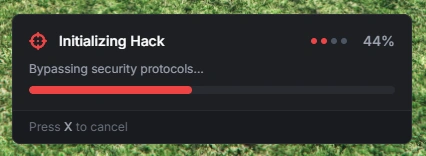
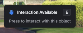
Text UI
Contextual text displays with markdown support, icons, and keybind indicators.
Options
| Option | Type | Required | Default | Description |
|---|---|---|---|---|
title | string | No | nil | Text UI title |
description | string | Yes* | nil | Main text content (supports markdown) |
position | string | No | 'center-left' | Position: 'top-left', 'top-center', 'top-right', 'center-left', 'center', 'center-right', 'bottom-left', 'bottom-center', 'bottom-right' |
icon | string | No | nil | FontAwesome icon class |
iconColor | string | No | '#71717A' | Icon color (hex) |
iconAnimation | string | No | nil | Icon animation: 'spin', 'spinPulse', 'spinReverse', 'pulse', 'beat', 'fade', 'beatFade', 'bounce', 'shake', |
keybind | string | No | nil | Keybind text to display |
*Either title or description is required.
Markdown
- Bold text:
**text** - Italic text:
*text* Code text:`text`- Line breaks:
\n
Functions
-- Show text UI
exports.lation_ui:showText(data)

-- Hide text UI
exports.lation_ui:hideText()

-- Check if text UI is open
local isOpen, displayText = exports.lation_ui:isOpen()
Return Values
isOpen():isOpen(boolean),displayText(string or nil)
Example
-- Basic text UI
exports.lation_ui:showText({
    description = 'This is a *simple* message with **formatting**'
})
-- Customized text UI prompt
exports.lation_ui:showText({
title = 'Interaction Available',
description = 'Press to interact with this object',
keybind = 'E',
icon = 'fas fa-hand-paper',
iconColor = '#3B82F6'
})-- Check if text UI is open
local isOpen, text = exports.lation_ui:isOpen()
if isOpen then
print('Text UI is open & currently displaying:', text)
end