Input Dialog
Input dialogs provide forms with various field types for collecting user data.
Dialog Options
| Option | Type | Required | Default | Description |
|---|---|---|---|---|
title | string | No | nil | Dialog title |
subtitle | string | No | nil | Dialog subtitle |
submitText | string | No | 'Submit' | Submit button text |
cancelText | string | No | 'Cancel' | Cancel button text |
type | string | No | 'default' | Dialog type: 'default', 'info', 'success', 'warning', 'error' |
options | table | Yes | {} | Array of input fields |
Field Options
| Option | Type | Required | Default | Description |
|---|---|---|---|---|
type | string | Yes | nil | Field type: 'input', 'number', 'toggle', 'checkbox', 'select', 'multi-select', 'slider', 'textarea', 'color', 'date', 'date-range' |
label | string | Yes | nil | Field label |
description | string | No | nil | Field description |
placeholder | string | No | nil | Placeholder text (input, textarea, color, date, date-range) |
icon | string | No | nil | FontAwesome icon class |
iconColor | string | No | '#71717A' | Icon color (hex or CSS color name) |
required | boolean | No | false | Whether field is required |
disabled | boolean | No | false | Whether field is disabled |
password | boolean | No | false | Password field with toggle visibility (input type only) |
min | string/number | No | nil | Min value (number, slider), min length (input, textarea), or min date for date/date-range picker (must match format) |
max | string/number | No | nil | Max value (number, slider), max length (input, textarea), max selections (multi-select), or max date for date/date-range picker (must match format) |
step | number | No | 1 | Step value (number, slider) |
unit | string | No | nil | Unit label (slider) |
options | table | No | {} | Options for select/multi-select (see Select Options) |
default | any | No | nil | Default field value |
checked | boolean | No | nil | Alias for default on toggle/checkbox types |
format | string | No | 'hex' / 'MM/dd/yyyy' | Color format for color picker: 'hex', 'hexa', 'rgb', 'rgba', 'hsl', 'hsla' or date format for date/date-range picker: 'MM/dd/yyyy', 'dd/MM/yyyy', 'yyyy-MM-dd', 'dd.MM.yyyy' |
clearable | boolean | No | true | Whether date/date-range picker shows clear button |
searchable | boolean | No | true | Enable search functionality (select, multi-select) |
Select Options
For select and multi-select field types, the options parameter accepts an array of option objects:
| Option | Type | Required | Default | Description |
|---|---|---|---|---|
label | string | No | nil | Display text for the option (uses value if not provided) |
value | any | Yes | nil | Value returned when option is selected |
disable | boolean | No | false | Whether the option is disabled and cannot be selected |
Notes:
'checkbox'is an alias for'toggle'- both render the same component.'checked'is an alias for'default'on toggle/checkbox types.- For
'date'type fields,min,max, anddefaultvalues must match the specifiedformat. - For
'date-range'type fields,defaultcan be used to set a default date rangedefault = { "01/01/2025", "01/07/2025" }.
Functions
-- Show input dialog
local result = exports.lation_ui:input(data)

-- Close any open input dialog
exports.lation_ui:closeInput()
Return Values
- Table of values (indexed by field order) or
nilif cancelled
Example
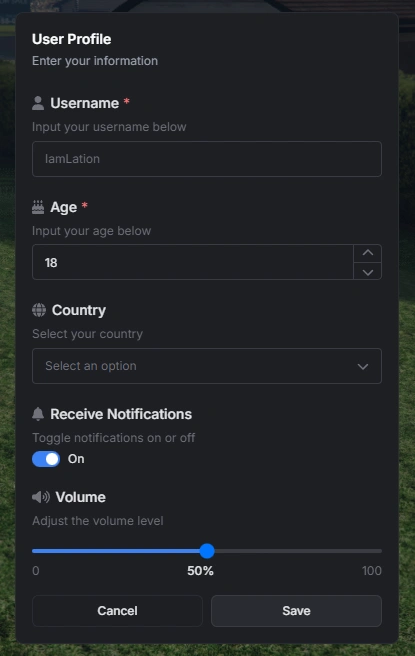
local result = exports.lation_ui:input({
    title = "User Profile",
    subtitle = "Enter your information",
    submitText = "Save",
    options = {
        {
            type = 'input',
            label = 'Username',
            description = 'Input your username below',
            placeholder = 'IamLation',
            icon = 'fas fa-user',
            required = true
        },
        {
            type = 'number',
            label = 'Age',
            description = 'Input your age below',
            icon = 'fas fa-birthday-cake',
            required = true,
            default = 18
        },
        {
            type = 'select',
            label = 'Country',
            description = 'Select your country',
            icon = 'fas fa-globe',
            options = {
                { label = 'United States', value = 'us' },
                { label = 'Canada', value = 'ca' },
                { label = 'United Kingdom', value = 'uk' },
                { label = 'Australia', value = 'au' }
            }
        },
        {
            type = 'toggle',
            label = 'Receive Notifications',
            description = 'Toggle notifications on or off',
            icon = 'fas fa-bell',
            default = true
        },
        {
            type = 'slider',
            label = 'Volume',
            description = 'Adjust the volume level',
            icon = 'fas fa-volume-up',
            min = 0,
            max = 100,
            unit = '%',
            default = 50
        }
    }
})

if result then
    print('Username:', result[1])
    print('Age:', result[2])
    print('Country:', result[3])
    print('Notifications:', result[4])
    print('Volume:', result[5])
end